


Pedro vs. Joaquin: battle of the yard signs
Production design as character in Eddington.

Arthouse girlies of the world, rejoice! A new Ari Aster movie is almost upon us. I’ve not seen a trailer for Eddington yet, nor read any reviews. I know the basic premise—it’s 2020, and COVID-19 is taking center stage in the Eddington mayoral race.1 But then, A24 posted this picture of two campaign yard signs:

And this got my antennae twitching. I’ve worked on a number of local political campaigns, and even ran for local office myself, so I know from yard signs. I especially know the mistakes rookies make with their yard signs, many of which are on display with these two. This isn’t to shade the production design here—quite the opposite, actually. Even knowing as little about the movie as I do, I’ve learned a lot about these two characters from the yard signs alone, mistakes and all.
When designing a yard sign, you want to keep in mind that the majority of your audience will see your sign from their cars. That means they’ll be moving quickly, and won’t have the time or ability to look closely. So you want to maximize visual clarity and impact, rather than information. The only critical information? Your name and the office you’re running for. Everything else can go on your website, or handouts, or other campaign swag. The number one goal of a yard sign is to get your name in front of people often enough that they remember it when they’re walking into the voting booth. If you can convey some kind of positive association alongside that, then great; but doing so can’t come at the expense of your name.
With that in mind, let’s get into it.
Sheriff Cross
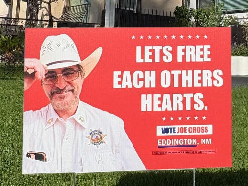
The Bad:
The photo has too many elements going on. For one thing, it looks like a Hinge pfp rather than a political headshot.2 He’s trying to convey down-home folksiness with the tipping of the hat, and power with the sheriff’s badge. But why can we see the iPhone in his chest pocket? Crop the phone. It’s cleaner.
His name is too small. Your name should never be smaller than the slogan.
Speaking of the slogan, “LETS FREE EACH OTHERS HEARTS” makes no sense, and is inadequately punctuated. Presumably neither he nor his target demo care about such things. This slogan is really just about vibes anyway, and I’m guessing the vibes are vaguely anti-masking.
The office he’s running for is missing. What are we voting you in for, Joe?
But what isn’t missing—and should be—is the state. We can assume these signs will be going up in and around Eddington; you just need the city! We all know we’re in New Mexico!
The Good:
White font on a colour background is always the way to go. It’s readable from a distance and at driving speed, which is what you want from a yard sign. Rookies will often go for colour on a white background, because that’s the cheaper option, but what you save in money you lose in readability.
It’s the visually cleaner sign overall, and it packs a strong visual punch.

Sheriff Cross is clearly going for the cowboy vote here. I’m sure he’s an anti-masker and anti-vaxxer, and I’m sure 2020-era xenophobic and racist dog whistles will factor into his campaign. I get strong George W. Bush vibes from this one; he’s learned that playing dumb works, especially against intellectual Black and brown people.
Mayor Garcia
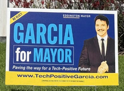
The Bad:
Too many colours. Duke blue, Carolina blue, yellow, plus a full colour photo? This is an expensive riot of colour.
And as for that photo…why do I need to see all the way down to his hands? A tight shot of his face and shoulders is all he needs.
The whole thing is too cluttered. Way too many words, and a lot of the fonts are small. The eye will naturally go straight to the biggest words—GARCIA for MAYOR, which is good—but will also be overwhelmed by the rest. In particular, the “re-elect” should be much larger.
The website gets so much real estate, and I’m sorry, but I’m never getting over TechPositiveGarcia.com! Garcia is the second-most common surname in New Mexico, but there’s gotta be a better way to differentiate yourself. Was TedGarciaForEddington.com simply not an option?3
“Paving the way for a Tech-Positive Future” is flagrantly meaningless, to the point that I have to assume his first race was entirely funded by the tech industry.
The Good:
Mayor is on there twice, so we know at a glance what he’s running for; and at a second look, that he’s already mayor.
Even though it’s too small, “re-elect” IS on the sign. Having it as a banner at the top left lets me know that he’s basically just modified his original yard sign, which is a time- and cost-saver. Nobody would trust an elected official who spent time and money designing an entirely new sign for their re-election campaign.
Even though it needs to be cropped, his photo looks professional. (Possibly too professional for his electorate, though.)

Mayor Garcia is the (campaign) poster boy for Obama-era tech optimism. Assuming mayoral terms last four years in Eddington, it tracks that he would have been elected just as that specific optimism was on its last legs. 2020 will be like running into a buzzsaw for him. I’m also willing to bet that the website itself is visually cleaner than his yard sign, and more polished than the URL would have you believe. He’s thinking more about his online audience than his real-life one.
Eddington is out in a few weeks, so we’ll find out how 2020 went for these candidates soon. Having been through it myself, I’m not optimistic. And based on the poster, and on Ari Aster’s whole, you know, deal, I’m pretty sure the movie’s not optimistic either.
It has also, unfortunately, taken center stage in my home. Writing this on COVID brain, so bear with your girl.
I guarantee he’s got a picture of himself on some platform somewhere holding an animal that he’s just killed.
I would probably call him Teddington affectionately. Just throwing that out there as an option.
They did Joaquin dirty with those photos lol.